Your cart is currently empty!
SCHFONTS — schöne fonts from Berlin, created by a small, independent type foundry that comfortably occupies the space somewhere between urban brutalism and 1990s club culture.
Experimental type design has long been a defining visual element of Berlin’s cultural and club scene. Within urban culture — shaped by electronic music, innovative flyer design, and bold poster art — typography has often embraced radically artistic approaches rather than prioritizing strict legibility. This spirit of creative experimentation forms the core DNA of Schfonts. Thoughtfully designed and technically refined, our typefaces are available as variable fonts with extensive OpenType features, along with broad language support for Latin and, in select cases, Cyrillic scripts.
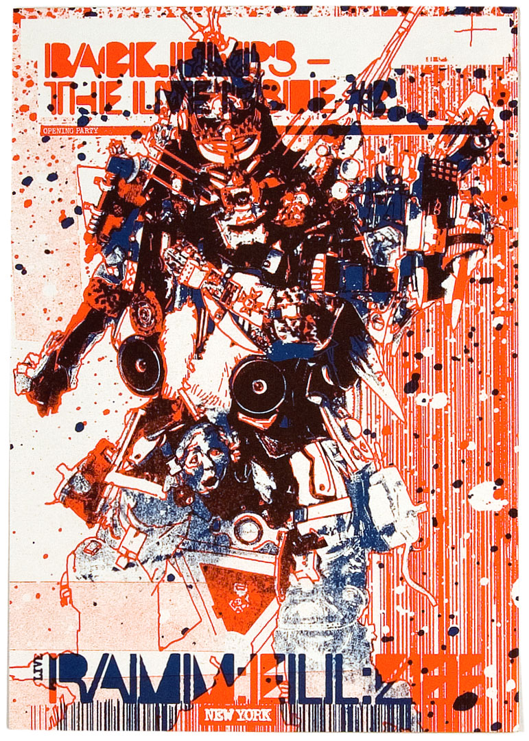
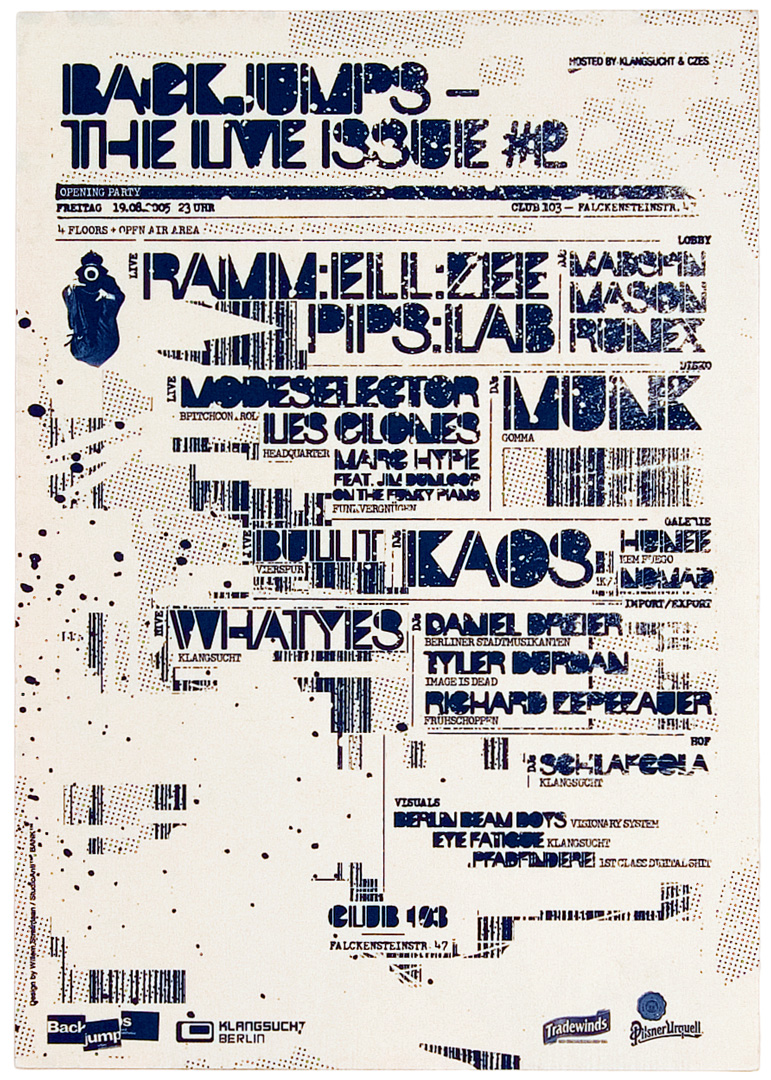
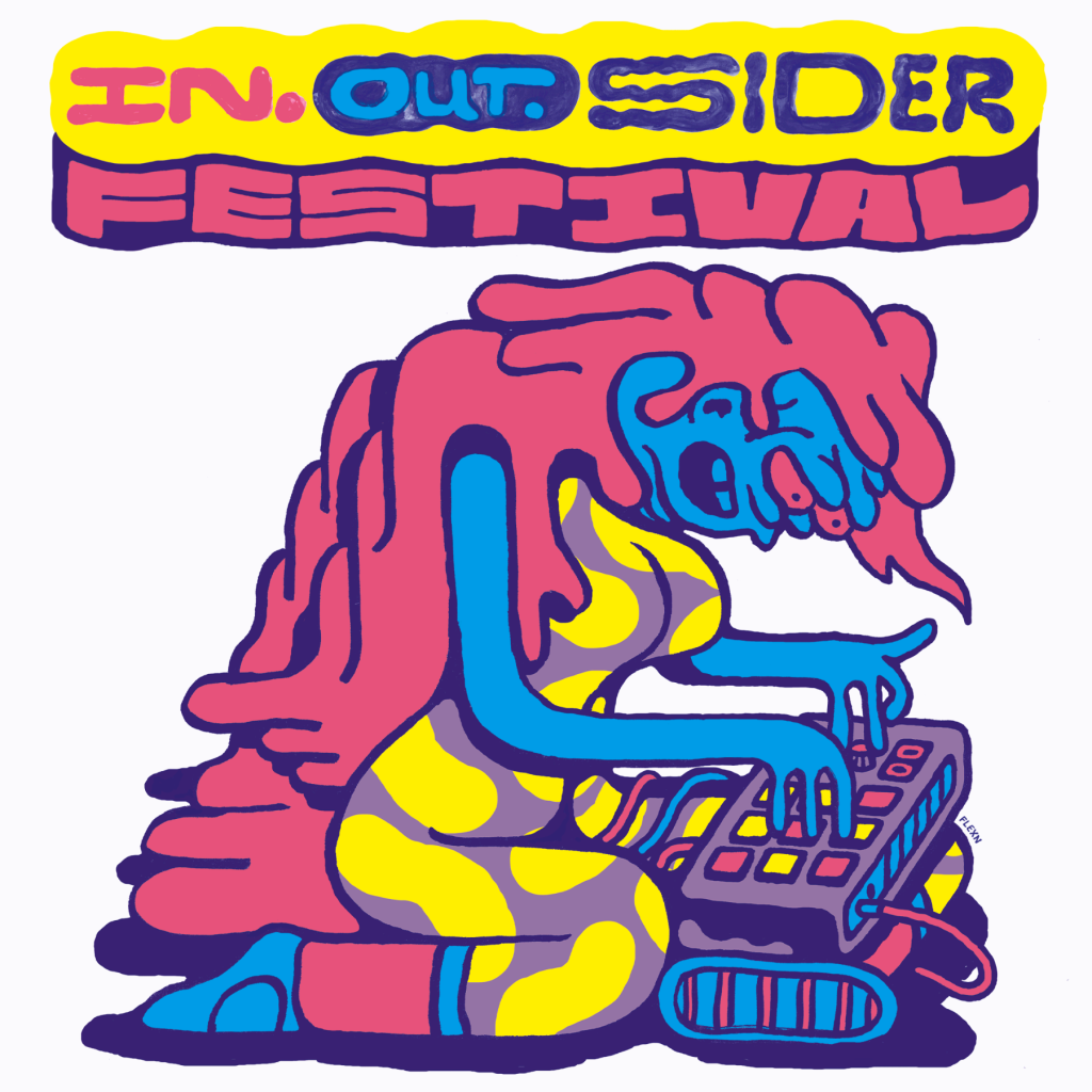
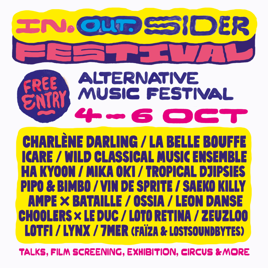
1. Backjumps – The Live Issue #2 – flyer by StudioAnti with a custom stencil-like Art Deco font by Flexn, 2005
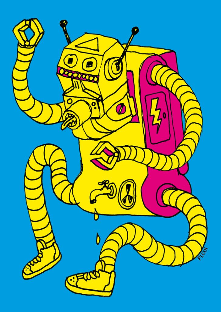
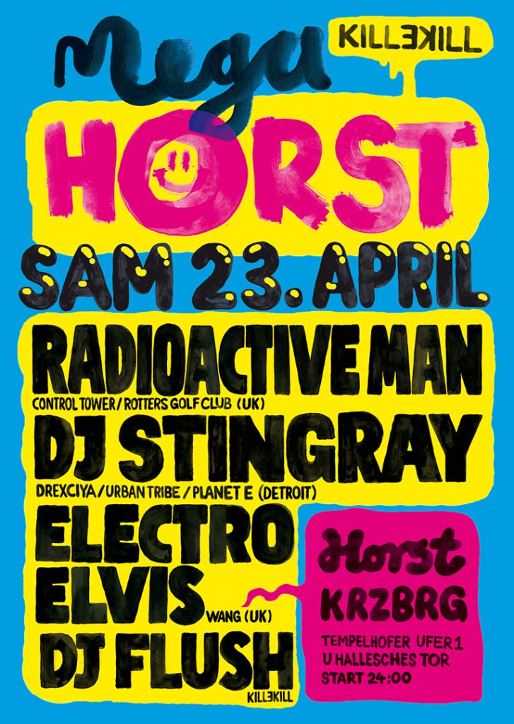
2. Megahorst at Horst Kreuzberg – poster and flyer series made entirely with handmade type, 2011
3. In-Out-Sider Festival – the handmade type from earlier Megahorst artworks was finally compiled to a proper font, 2024
The Team — Nishan Bonnen is a Berlin-based startup veteran and experienced digital creator. Under the name Bonnie & Byte, he has developed and designed projects such as the website of Martin Sonneborn, while continuously exploring and experimenting with new technological innovations.
Jakub Kanior, known by his longtime nickname Flexn, has been active as a designer and artist in Berlin’s cultural and club scene since the 1990s. He has created numerous posters, record covers, and label identities. His deep interest in typography has consistently inspired new type projects, many of which still carry the energetic and forward-thinking spirit of Berlin’s creative awakening in the 1990s.